
How to Create a Sticky Footer with Flexbox

Creating a sticky footer is one of the most common web development tasks you can easily solve with flexbox. Without a sticky footer, if you don’t have enough content on the page, the footer “jumps” up to the middle of the screen, which can completely ruin the user experience. Before flexbox, developers used negative margins to force the footer down to the bottom of the page. Luckily, we don’t need such a hack anymore!
In this article, we will show you an easy technique that allows you to create a sticky footer with flexbox. It takes just a few lines of code and a couple of minutes to implement it.
1. Start with the HTML
In our HTML file, we create a heading, two paragraphs with some lorem ipsum text, and a footer so that we can easily test the sticky footer functionality. Open your code editor, create a new folder (or project, depending on the code editor) and an empty index.html file inside of it. Then, add the following code:
Sticky Footer with Flexbox
Sticky Footer with Flexbox
Lorem ipsum dolor sit amet, consectetur adipiscing elit, sed do eiusmod tempor incididunt ut labore et dolore magna aliqua. Ut enim ad minim veniam, quis nostrud exercitation ullamco laboris nisi ut aliquip ex ea commodo consequat.
Duis aute irure dolor in reprehenderit in voluptate velit esse cillum dolore eu fugiat nulla pariatur. Excepteur sint occaecat cupidatat non proident, sunt in culpa qui officia deserunt mollit anim id est laborum.
2. Add Some Basic Styles in CSS
To make our demo work, let’s start our CSS file with some simple resets and basic styles. However, note that these basic styles are just recommendations and you can use any other styles instead of them — they are not required for the sticky footer functionality.
Create a style.css file in the same folder where your index.html file is found. Then, add the following code:
/* Basic styles */
* {
    box-sizing: border-box;
    font-family: sans-serif;
    margin: 0;
}
body {
    font-size: 1rem;
}
.content {
    padding: 1.5rem;
}
h1,
p {
    margin: 1rem 0;
}
3. Style the Footer
Now, we add some CSS styles to the footer as well, however, note that this is still not the sticky footer functionality. You can change these basic footer styles to any other design you like.
Add the following code to your stlye.css file, below the previous CSS block:
/* Basic footer styles */
footer {
    width: 100%;
    background: #111;
    margin-top: 1.5rem;
}
ul {
    padding: 1.25rem;
    text-align: center;
}
ul li {
    list-style-type: none;
    display: inline-block;
    margin: 0.25rem 0.75rem;
}
ul a {
    color: #fff;
    text-decoration: none;
}
ul a:hover {
    text-decoration: underline;
}
If you check out the demo now, it will look like the below image:
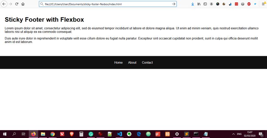
As you can see, the footer is displayed in the middle of the screen due to the lack of sufficient content. We will push it down in the next step with the help of flexbox.
4. Make the Footer Sticky with Flexbox
Now let’s see the CSS code that we need to use to create a sticky footer with flexbox. In fact, it is just five CSS rules. You can use this technique with any kind of footer in any browser that supports flexbox. Flexbox support is pretty good by now; currently 97.93% of all browsers in use support it globally, and it’ll get even better with time.
Here is the code you need to add to your style.css file. Ideally, you should add this snippet before the general footer styles (added in the previous step):
/* Sticky Footer */
body {
    min-height: 100vh;
    display: flex;
    flex-direction: column;
}
.content {
    flex: 1;
}
footer {
    flex-shrink: 0;
}
In the code above, we created a column-based flex layout with the help of the display: flex; and flex-direction: column; rules. As a result, the entire tag works as a flexible column — with .content at the top and


